Why klustR?
I first thought of developing a dynamic clustering package while studying k-means clustering algorithms in BYU-Idaho’s Machine Learning and Data Mining class (an excellent course, by the way). The package we used–and to my understanding the most widely used package–for k-means cluster visualization is called cluster and contains the function clusplot. I’ll demonstrate using state.x77 found in the datasets package:
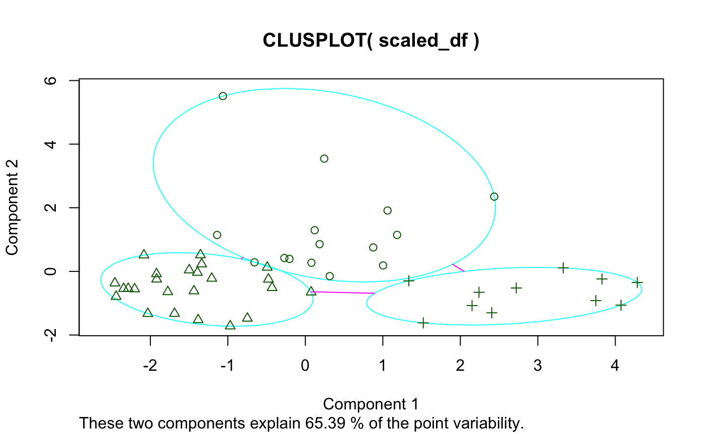
And here’s if you add some options:
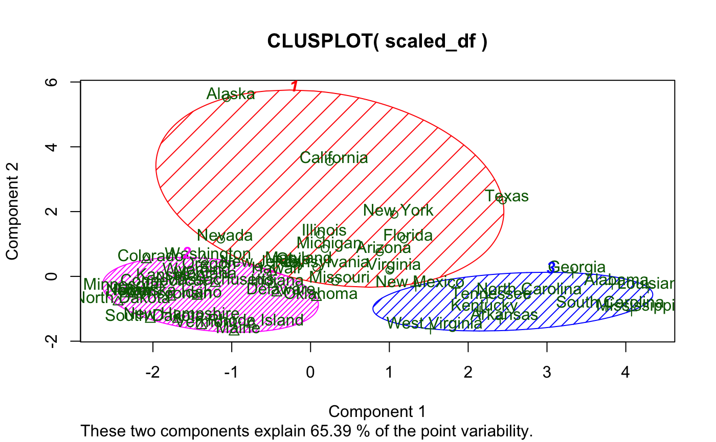
While I like the idea of principal component analysis (PCA) being applied to cluster visualization, there are definitely some flaws with this visual, primarily:
- Base graphics
- Let’s face it, they just look outdated
- Labels
- Majorly overlap each other (especially in the plot window) making readability non-existent
- Not to mention they also cover the data points
- And they’re the same color as the data points
- Principal component (PC) contribution
- It’s lumped together
These visualizations may have their place, and I in no way discount the rest of cluster based on clusplot()–just to be clear. I’m sure the author of the package is a far better R programmer and statistician than I am.
Problems Solved
klustR is a simple package (at least at the point of its initial release–I may add more features later) consisting of six functions: pcplot(), pacoplot(), and their associated Shiny reactive friends. pcplot() seeks to solve the issues with clusplot(), while pacoplot() is a little something extra–a parallel coordinates plot.
Rather than talk about the features, I’ll demonstrate.
pcplot()
Here’s a basic example using the data and k-means analysis from above:
Some things to note:
- Hovering over a point displays its label (solves problem 2)
- Axis labels show the percent contribution individually
- Clicking on a color in the legend highlights a cluster
- Clicking on an axis label (i.e. “PC2 - 20.40%”) displays a bar-chart showing the contribution of each column to that PC (solves problem 3)
We’ve also got options here. We can change color scales, label sizes, point sizes, and toggle grid-lines.
pacoplot()
Another great option for cluster visualization is the parallel coordinates plot.
Here’s an example:
Some things to note:
- Each axis is a column in the original data with its natural scale
- Hovering over a line displays its label
- Clicking on a line will display all the observations in the associated cluster
- Multiple clusters can be viewed at the same time
- Clicking “Toggle Averages” displays the median observation in each cluster with bars indicating the 1st and 3rd quartile for each axis for each cluster
pacoplot() has the same options as pcplot() except grid-lines as that would make no sense on a parallel coordinates plot, and with the addition of measures which allows the user to specify their own functions to be evaluated for the average lines and the upper and lower bounds of the intervals.